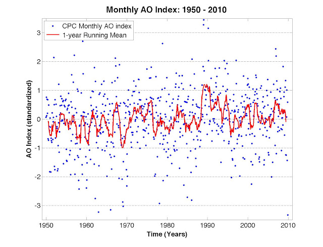
A big driver of the outbreaks of record cold and snow in many spots around the Northern Hemisphere is the little blue dot at the lower right-hand corner of the graph above, just above the year 2010. The chart (generated by Ignatius Rigor for Dot Earth) shows the state of the Arctic Oscillation, a pattern of atmospheric pressure that has two phases, positive and negative (somewhat like the more familiar cycle of El Niño and La Niña in the Pacific). A strong negative or positive condition can powerfully influence weather around the northern half of the globe and the behavior of sea ice on the Arctic Ocean.
The blue dot shows an extraordinary negative plunge of the index in December, taking it below any such reading since at least 1950. (I ran a preliminary version of the chart in a recent post on sea ice trends, but now it’s been updated with the full month’s readings of atmospheric pressures.)
Good article for those curious about why it's so cold right now across the US. No, global warming isn't likely involved and no, it doesn't invalidate warming data either (see here: http://www.tnr.com/blog/the-vine/why-yes-it-chilly-out-right-now)